Adjusting the colors you wear, the colors you surround yourself with, and the lighting around you will help you adjust your emotions. This is a matter of understanding not just the generalizations and applications generated by scientific research, but your own associations as well.
1. Color temperature
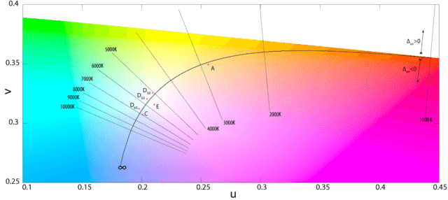
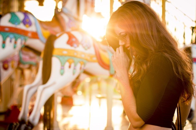
In layman’s terms, color temperature is the intensity and brightness of light. As the term color temperature suggests, the level of brightness has a direct bearing on color. You can view an interactive example of color temperature’s effect on a room at the Lightbulbs website. Note how the different levels of light change the hue of the room. The 6500K setting renders the room bluer and is closest to the sun’s intensity at high noon. The lower the color temperature, the warmer and more golden the light, the warmer the color of the room. Light at a higher color temperature promotes a higher level of alertness, while lower, redder light has a calming effect. Simply the way you light a room can help determine your level of energy.
2. Blue light and sleep
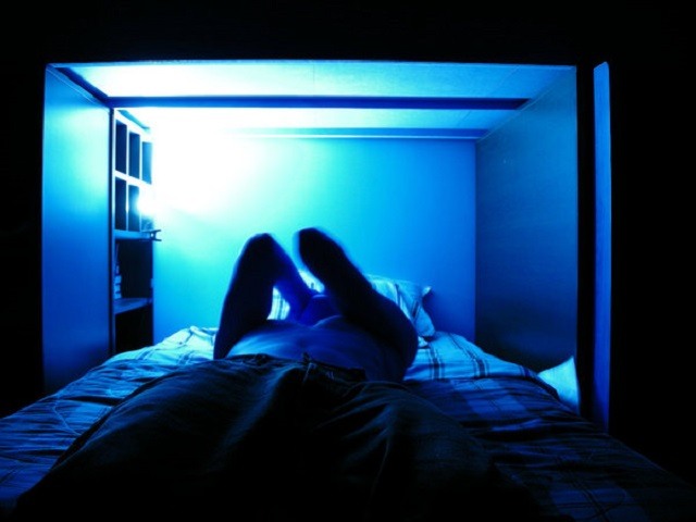
Bluer light, which has a higher color temperature, is closer to midday sunlight and has an alerting property. Research from PLOS Biology explains how this type of light interacts with the brain. Blue light interacts with a photopigment called melanopsin. Melanopsin is especially sensitive to blue light, and together with the rods and cones in our eyes, it signals the brain to be vigilant. Green light has the opposite effect—it promotes sleep. According to the researchers, “All studies converge to show that blue-enriched light is more efficient in increasing performance and decreasing sleepiness.” Your cell phone and your computer screen emit a great deal of blue light. Have you looked into how a lack of sleep affects your mood? If you’re getting too much blue light throughout the day, particularly near bedtime, your sleep may be suffering. In turn, you’re crankier, more depressed, overly emotional. The good news is you now know that green light helps with sleep. Working on a computer all day? A program such as F.lux adjusts your screen’s color temperature so you’re not constantly inundated with blue light.
3. Color and light
I’ve been discussing the color temperature of light and its effect on the brain. Light also determines how we see color. When light hits an object, such as a banana, the banana absorbs some of the light and reflects the rest. When you look at a banana and see yellow, it’s because the banana is reflecting back light that fits within a certain wavelength. That wavelength corresponds to the color yellow.
In turn, your brain has a certain association with the color yellow. The association our brains have with colors, and the resulting emotions and impulses, are very important. For one, they influence something as simple as choosing a tablecloth. Occitan Imports has an interesting point to make here. In the blog post, A Simple Question of Color, they chronicle how a customer asked if a red tablecloth was more on the ‘blue side’, or the ‘orange side’, of red. The answer to the question would determine the purchase. Occitan points out that, “The color of an object is heavily influenced by the nature of the light that is hitting it.” This is because, as you saw earlier, the color temperature of light interacts with the hue of objects. Try changing the color temperature of the light in your room to see how it affects your mood. To treat Seasonal Affective Disorder and other common mood disorders, counselors often recommend light therapy. Light therapy alters color temperature to simulate sunlight, which really brings out the full color of things.
4. Color and the emotions
How, exactly, color alters emotions is still being studied. A study of college students found that they had the most positive emotional responses to the principle colors: red, yellow, green, blue, and violet. Red is associated with excitement, passion, and warmth. Green is calm, refreshing, balanced. Yellow is stimulating, optimistic, confident, friendly. Blue is intellectual, logical, trustworthy. Violet is luxurious, authentic, spiritually aware. These are the positive associations, but the study also found cultural and personal experience creates positive or negative associations. There are negative emotional analogues to colors. Yellow is oftentimes associated with fear, red with rage, green with boredom, violet with feelings of inferiority, and blue with coldness and unfriendliness. Black can be associated with emotional security and safety, but it also can suggest menace and emotional coldness. Brown can be reliable, supportive, serious, but it can also be humorless. Pink can be tranquil, warm, and loving, but too much can be emotionally claustrophobic. Orange can be fun, vibrant and active, but can also be frustratingly frivolous and immature. Gray is neutral at best. White is clear and pure, but can be unfriendly, expressionless, sterile. To evoke certain emotions with colors, to alter mood, pay attention to the emotions colors cause in you. If you’re feeling dull and trapped, try red. If you’re feeling anxious, try green. If it seems like you make people feel uncertain, try blue. Work with the lighting and the colors in your workspace and your home until you find a balance that feels right to you. Work with the lighting and the colors in your workspace and your home until you find a balance that feels right to you.


